CANVAS REDESIGN CHALLENGE
Canvas is an online learning management platform used by the University of Washington. I, along with two other people was tasked to redesign UW's Canvas to fit with modern sensibilities.
CLIENT
CLASS ASSIGNMENT PROJECT
MYROLE
UX RESEARCHER
TEAM
GROUP CONTRIBUTION
TIMELINE
8 WEEKS FROM APR 2021 - JUN 2021

OVERVIEW
A responsive online assignment system that helps students in accessing resources to complete homework with the least amount of stress
My central focus during the design process was to develop components, wireframe and prototype the online assignment application
PROBLEM STATEMENT
Jim gets frustrated trying to complete some homework for an online class since he cannot find the links that would show him how to complete it. Jim needs clear and easy access to his assignment, with clear files and due dates. He also wants to know exactly what percentage of his grade each assignment is worth. Our solution should provide the student easy access to the resources he needs to complete the homework according to the given guideline
DESIGN QUESTION
How might we help students in accessing resources to complete homework with the least amount of stress?
USER PERSONA
Jim is a potential user who would like to receive relevant and comprehensive information in order to make timely decisions for his assignments as a Freshman at UC Berkeley.

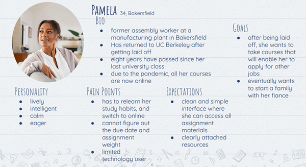
Pamela is a returning UC Berkely student that's been struggling on figuring out the school's assignment system due to her not being very tech-savvy oriented user.
CONCEPTUALIZATION
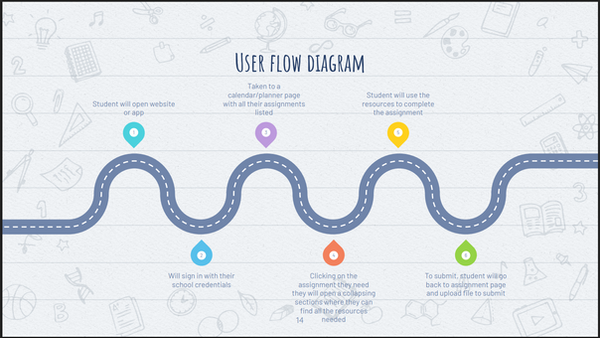
USER FLOW
These two user stories were merged to create the user flows. Where my prototype includes a redesigned dashboard, resources, prompt and grading students can look at with ease.

IDEATION
We used a design process called "HOW-NOW-WHAT" ranking chart, as well as a funnel process to generate alternate design process. This process involves brainwriting and affinity diagramming.

USER STORIES
-
As a user, I want to have the ease of access without taking too much time to understand the UI
-
As a user, I want to be able to find the resources without having the website unresponsive
-
As a user, I want to be able to view my homework assignment online without adding any additional stress
-
As a user, I want to be able to view date of my homework assignment and what percentage of my grade is worth without wrestling with the website's unresponsive design.
RESEARCH
USER TASKS
-
Most User's task are completed in less than five clicks; they still go through a general sequence as we identified before the exploration
-
The task of submitting an assignment varies in process between courses; some assignments may require a specific files while others are more flexible.
-
Most of the time users are taken to a home page from where they can navigate to their specific assignments that a user is looking for
USER ATTRIBUTES
From our analysis of multiple users (20 users) we've interviewed, majority of users are either students or professors, most are frequent users of technologies and have a preference with either a smartphone or computers.

UNDERSTANDING OF USER PAIN POINTS
From our explorations of user's pain points that users sometimes have to use other websites or programs to complete assignments for multiple classes, which was a pain point that we learned of; it means that they need to leave the online course or open a new tab/window to accommodate the external website or program.
Another pain point that we learned is having some assignments show up in a calendar and others not.
WIREFRAMES
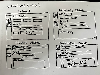
LOW-FIDELITY
The low-fidelity wireframes were then created and later digitalized on Figma for the mid-fidelity prototype with placeholder text, images, and icons.

DESIGN
MOOD BOARD
I approached my iteration of high-fidelity prototypes by making a mood board with a few icons and images of relevant, small-scale, and relevant information.
This mood board was later incorporated into the style guide, with includes logos, typography, images, icons, UI elements, and so on.

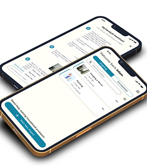
HIGH-FIDELITY WIREFRAMES


CONCLUSION
This project was my first taste into User Experience Design. I learned a lot multitude of skills and gained experience that I can implement into this project. Skills I've learned in UX are Wireframes, User Tasks, User Research, User Journey and User personas.
The following steps will be to do extensive usability testing, which will undergo either in virtual or in-persona interviews. That way, I can observe how my participants will interact with the application and provide feedback to any concerns they may have. The next step will be to adapt to user with color blindness since color-coding for classes is essential to the functionality.
THANK YOU FOR TAKING THE TIME TO VIEW MY CASE STUDY!!
If you're interested, you can view some of my other work here: