myhandyai: ai-powered diy app
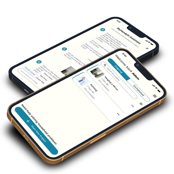
MyHandyAI is an AI-powered DIY app that helps guide people on DIY projects without the need of paying a handyman. I designed the experience and interface of the DIY app for their upcoming iOS & Android app.
CLIENT
MYHANDYAI, PRODUCT MANAGER ACCELERATOR
MYROLE
UX RESEARCHER & DESIGNER
TEAM
DEVELOPERS, DATA SCIENTISTS, PROJECT MANAGERS
TIMELINE
12 WEEKS IN SUMMER 2025
PROBLEM STATEMENT
Homeowners waste an average of $500+ annually on minor repairs that could easily be completed as DIY projects. Unfortunately, 70% of DIY attempts end in frustration due to lack of personalized guidance.
The Solution? Snap. Solve. Save. MyHandyAI redefines home repair by delivering expert, personalized guidance instantly, making fixes simpler, faster, and more accessible.
MY ROLE
As part of the MyHandyAI team, I conducted UX research, design, and prototyping while partnering with cross-functional teams to iterate quickly based on feedback.
CONCEPTUALIZATION
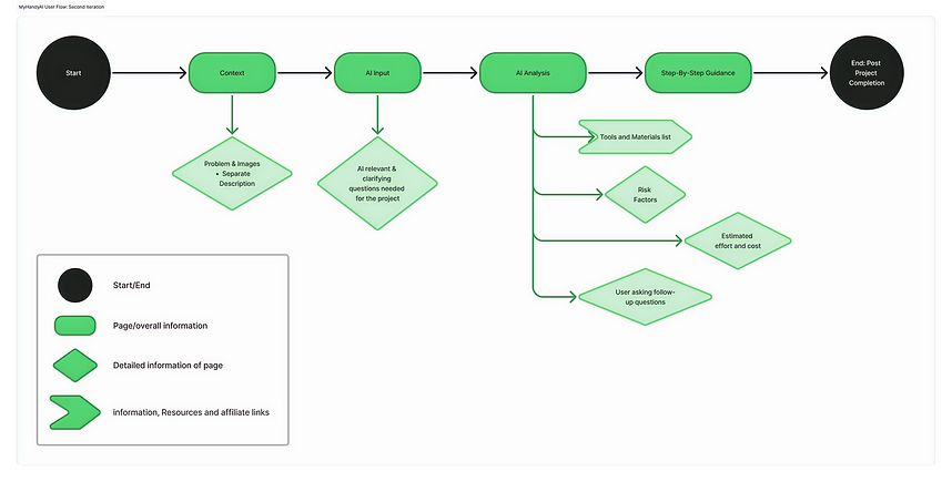
At the early stage, I created a basic user flow so that internal company stakeholders and team member can see the big picture to understand a user's path navigating through the MyHandyAI app.

A user flow and Information architecture was created in order to ensure a competitive solution and analysed of other leading apps in the DIY handyman space.
SURVEY
A total of 35 people responded to a survey from July 12th to July 26th, 2025.
Most of the survey respondents, about 55% are homeowners, 42% are not homeowners and 7% are others.
The biggest key pain points on competing apps that I gathered from the survey was
-
Information Overload & Quality
-
Knowledge & Confidence Gaps
-
Trust & Reliability of Professionals
-
Cost sensitivity
-
Decision- Making Friction
The most common pain point that I found was:
-
Information Overload & Quality
-
Knowledge & Confidence Gaps
-
Cost sensitivity
I conducted user interviews and surveys via 35 participants. I created a chart with High, Low pain, Low and High importance on which priorities that I should focus on.

Next, I created a series of risk assessments for internal company stakeholders so that our communications between team members are consistent and advocate for or against particular activities or approaches during the design phase.

CORE CUSTOMER ISSUE
HIGH COST
User worries about high cost of a DIY project, oftentimes would have to calculate the cost by themselves.
LACK OF USER EDUCATION
Users not knowing what tools to use often leads to confusing instructions and or instruction assumes user had prior baseline project before begin a project.
OPERATIONAL RISK
Lack of prioritization discipline could lead to overbuilding or incomplete flow at MVP.
THE PERSONA
Based on my insights and findings, the goal for the persona is to attract the younger homeowners around the age group. The age is reflected on the persona itself.

INFORMATION ACHITECTURE
One of the major issues I identified was navigation. I created the information architecture map and came up with a brand new global navigation bar to help users navigate through the app.

I conducted a card sorting study to evaluate the information architecture of the app. In card sorting, participants organized the cards with other leading app's items into groups in a way that makes sense. About 30 people participated in my card sorting study.
USER JOURNEY MAP
To make team members and internal company stakeholders understand the path of a user navigating through our app, I created a user journey map.

REFINED USER FLOW
After I established the persona, user journey map and pain points, I went back and refined the user flow so that it matches my research and my target MVP guidelines established prior to creating the first user flow.
DESIGN
During this stage of the design process, I researched different style and design to help envision MyHandyAI's interface. I also analyzed apps currently in the market to incorporate useful ideas in the design.

Visual design inspiration, from top left to bottom right.

Once references are all gathered, I created a set of guidelines on fonts, text size, grid layout and screen target. This way so that the screens can stay consistent with the rest of the screens.

LOW-FIDELITY WIREFRAMES
After the guideline was created, I created a series of low-fidelity wireframes starting from the home menu screens and refined the user steps during this early stage of the design process.

Low-fidelity wireframes were then created and later incorporated into the DIY app, where my test participants can interact and perform tasks for the usability of this DIY app.

During this process, a four-column grid was utilized to convert the initial designs into mid-fidelity wireframes.
As the project progresses, I created an Excel sheet and listed which priorities I should focus on.
-
1. Means most important
-
2. Means the least important

I focused on New Project, My Project, About the app, user account, authentication and setting because it was crucial to have those features in the MVP first prioritized. I learned that those features can take a maximum amount of complexity when it comes to management and development.
USABILITY TESTING
During this process, the design had gone through multiple ideations. I conducted several usability testing with the initial design to gauge user feedbacks.

FINDINGS
#1. MyHandyAI's navigation has been improved.

#2. Confusion around user flow of the Step-by-Step guide and too wordy.

7 out of 8 participants felt that the Step-by-Step's user flow was confusing and wordy
#3. Confusing User flow for the Project Overview page

8 out of 8 participants felt that the Project Overview page felt there was too much text and not enough interactable elements.
REFINEMENTS
ITERATION: REDESIGN THE HOME MENU
Testing were primarily conducted by user interviews as well as feedbacks from product managers. Here are some issues pointed out from the result:
-
Product's home menu should be changed as the UI is way too cluttered and not streamlined.
-
Users should be able to see their concurrent and previous projects on the home menu
- Repair Category should not be in the home menu, it should be under the search section
V1

V2


ITERATION: USER STEPS
Among another challenge that I faced was the user steps. Here are some issues that I was also tasked with refining:
-
User should be able to go back to their last question and change their answer
-
User should be able to see their progress, this means they need to see the total & number of questions answered/not answered.
-
User can ask questions, and product should be able to provide/ explain the question.
ITERATION: PROJECT OVERVIEW
Lastly, the project overview screens. Several users pointed out the unevenness of the screen as it felt very out of order. To do this, I plan to:
-
Estimated Breakdown should be on top of the screen
-
Include project detail/ summary of the project to make the user easier to understand.
-
Move the project tools below the project detail section so that it flows logically.
V1

V2


ITERATION: CLARIFYING QUESTIONS
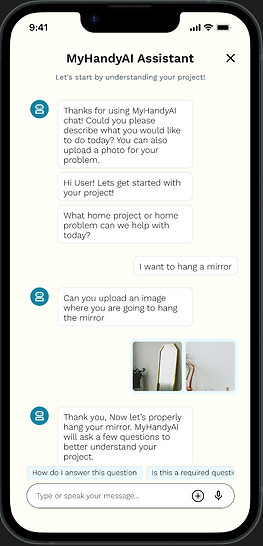
I also refined the clarifying questions screen. The screen itself was barely worked on, so I tasked myself into refining the screen. Here's what I did:
-
Re-word pre-made question prompt to make sense to the user.
-
Fix up some grammatical error of the AI prompt.
-
Changed and re-aligned design elements to make sure that they're consistent throughout all screens.
FINAL DESIGN


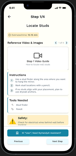
PERSONALIZED STEPS
Personalized steps to help accommodate based on a variety of a user's projects with MyHandyAI's powerful AI.
TOOLS RECOMMENDED BASED ON YOUR NEEDS
Finding tools becomes much faster with MyHandyAI's State-of-the art AI assistance
POWERFUL AI THAT HELPS YOU ALONG THE WAY
Feeling stuck on a project? MyHandyAI guides you every step of the way with our powerful AI assistance.
REFLECTION
In the span of 12 weeks, I have created over 100+ wireframes and updated over 25+ components. I truly appreciate the opportunity given to be a part of this amazing project and feel extremely proud of what our team has produced. Staying within scope felt rather challenging at first as there were times some directions weren't clear and I wasn't able to contribute as much to certain parts of the project. However, this opportunity has provided me to not only learn my skills in UX but also to inform clients of best practices and make updates to lay the foundation for a solid desirable design system.
MOVING FORWARD
MyHandyAI successfully transformed an underused touchpoint in the customer journey. By grounding the design decisions in user research, I had developed design and content solutions that directly addressed the distinct needs having a handyman DIY and AI assistance in the palm of the user's fingertips. The success metrics established for this project will continue to inform iterative improvements, ensuring the buyer's guide evolves with changing customer needs. The research methodologies, personas, and design principles developed during this project also provide a replicable framework for enhancing other customer touchpoints across the MyHandyAI experience.
This case study exemplifies how thoughtful UX research and design can transform business constraints into opportunities for meaningful customer experience improvements.
Let's Work Together!
If you have a project in mind, or would like to chat, shoot me an email at
xiongjin631@gmail.com. I'd love to hear from you.