SHOPPILY: GROCERY APP
Shoppily is a personalized grocery app design concept. It was part of the Microsoft sponsored course via Coursera and was inspired by design of Amazon, TrueCoach & Flipp.
CLIENT
PERSONAL PROJECT, MICROSOFT CERTIFICATION COURSE VIA COURSERA
MYROLE
UX RESEARCHER & DESIGNER
TEAM
INDIVIDUAL CONTRIBUTION
TIMELINE
8 WEEKS FROM NOV 2024 - JAN 2025

Shoppily was inspired by Amazon's mobile app, TrueCoach and Flipp. The first of which is a delivery service, the second is a personalized training coach and the last one is a personalized shopping app.
INSPIRATION
MY ROLE
My goal was to combine the concepts from three established services and combined them into a personalized shopping app that's aimed towards the urban & suburban market.
EARLY SKETCHES
I sketched out a few concepts on paper to nail down information hierarchy from the landing screen to the checkout screen.
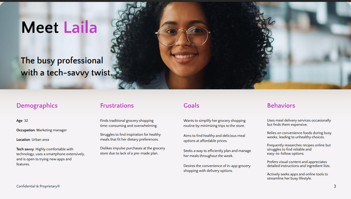
Maria is a founder of a fitness apparel startup who occasionally rely on meal service but finds it difficult streamline her cooking process and finding readily available healthy convenience food. Maria also finds it difficult to find a recipe that suits her needs to due to sheer volume of recipes online.

CONCEPTUALIZATION
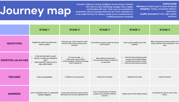
USER JOURNEY
These two user stories were merged to create the user flows. Where my prototype includes a redesigned dashboard, resources, prompt and grading students can look at with ease.
USER STORIES
-
As a user, I want to have the ease of access without taking too much time to understand the UI
-
As a user, I want to be able to find the resources without having the website unresponsive
-
As a user, I want an app that prioritize both my healthy eating habit while planning my meals efficiently during a busy week
-
As a user, I need a way to seamlessly purchase groceries directly with the app, eliminating the need for a separate shopping trip.
REFINING
USABILITY TESTING
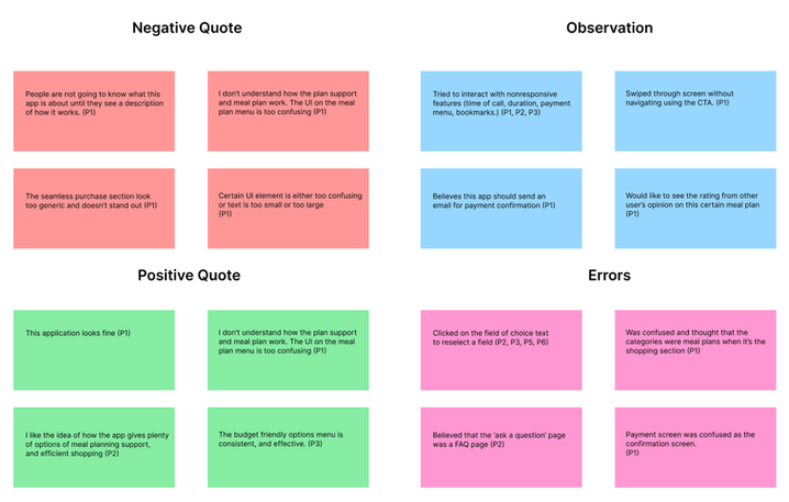
The grocery shopping app has gone through several iterations. As part of my latest iteration, improvements were based on issues my participants faced while taking part in interviews and surveys. In addition, these tests have allowed my participants to give me suggestions for what I can include in improving my application.
WIREFRAMES
LOW-FIDELITY
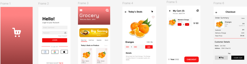
The low-fidelity wireframes were then created and later digitalized on Figma for the mid-fidelity prototype with placeholder text, images, and icons.

MID-FIDELITY
The low-fidelity wireframes were then created and later digitalized on Figma for the mid-fidelity prototype with placeholder text, images, and icons.
DESIGN
MOOD BOARD
I approached my iteration of high-fidelity prototypes by making a mood board with a few icons and images of relevant, small-scale, and relevant information.
This mood board was later incorporated into the style guide, with includes logos, typography, images, icons, UI elements, and so on.


REFLECTION
Throughout the process, I encountered difficulties in several areas of my research. Among them was the user interviews, and usability testing. In which I struggled to find questions that resulted in short responses or information that I was unable to apply to my studies from inconclusive results. However, this was my first solo UX design project, and I have come to learn a multitude of skills and gained experience that I can implement into this application.
The following step will be to do more usability test, which will then undergo virtual or in-person usability testing. This way, I can observe how my participants interact with the application and provide a thorough explanation or address any questions they may have in the future.
Let's Work Together!
If you have a project in mind, or would like to chat, shoot me an email at
xiongjin631@gmail.com. I'd love to hear from you.