SHOPPILY: GROCERY APP
Shoppily is a personalized grocery app design concept. It was part of a hack-a-thon challenge and was inspired by design of Amazon, TrueCoach & Flipp.
CLIENT
PERSONAL PROJECT
MYROLE
UX RESEARCHER & MOBILE DESIGNER
TEAM
INDIVIDUAL CONTRIBUTION
TIMELINE
8 WEEKS FROM NOV 2024 - JAN 2025

Shoppily was inspired by Amazon's mobile app, TrueCoach and Flipp. The first of which is a delivery service, the second is a personalized training coach and the last one is a personalized shopping app.
INSPIRATION
MY ROLE
My goal was to combine the concepts from three established services and combined them into a personalized shopping app that's aimed towards the urban & suburban market.
RESEARCH METHOD
At the early stages of the process, it was important to understand problems with current market personalized grocery apps out there. I establish a baseline with a customer's journey map and separate them by evaluation.
First, I use A/B testing and card sorting to figure out a customer's pain point and related issues to document my findings. Next, I conducted a market analysis of leading apps in the personalized grocery space.
During this process, I used the Critical Incident Technique. I find using this process more helpful since it allows me to gauge a better understanding from a user's perspective through observation rather than opinions.
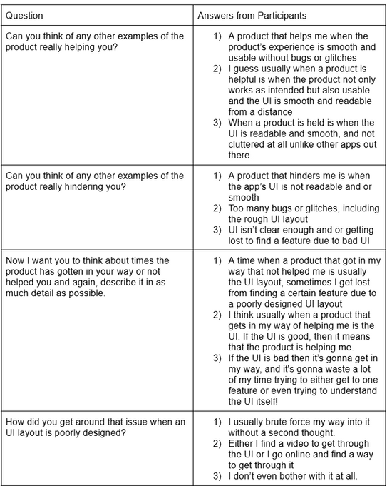
Following the user interview and critical incident technique session I conducted, I created a user story scenario. I made this in order shape what the app would look, that way I can use it as a starting point.
USER STORY SCENARIO
-
As a user, I want to have the ease of access without taking too much time to understand the UI
-
As a user, I want to be able to find the resources without having the website unresponsive
-
As a user, I want an app that prioritize both my healthy eating habit while planning my meals efficiently during a busy week
-
As a user, I need a way to seamlessly purchase groceries directly with the app, eliminating the need for a separate shopping trip.
CORE CUSTOMER ISSUE
LACK OF PERSONALIZATION
Lack of personalized features that caters to a user's specific needs, and often personalized features are very poor.
CLUTTERED UI
Cluttered UI and disorganization, as well as lack of hierarchal structures created poor UI readability to users, often getting lost and further increases poor usability.
POOR USABILITY
Small issues like redundant confirmation, lack of user education and the inability to add multiple positions and organizations for created hurdles that coalesced into poor usability.
THE PERSONA
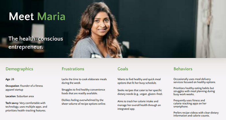
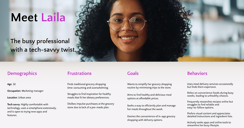
Several personas was created after I established a baseline and issues with customers regarding to the current personalized shopping apps out in the market. I've aligned the persona's traits based on their habits, traits and place of residence.
USER JOURNEY MAP
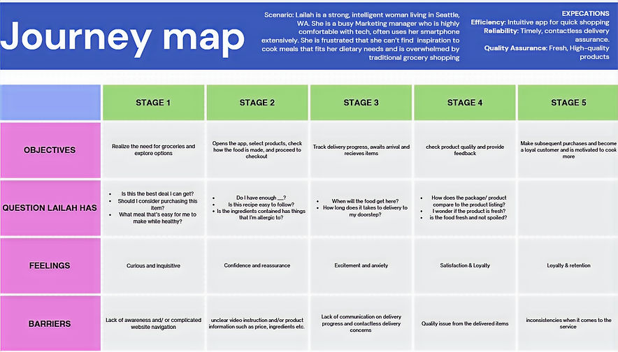
In order to understand the path of a user navigating through the Shoppily app, I created a user journey map.
USER FLOW
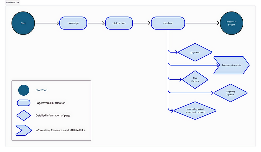
After i established the persona, user journey map and pain points, I created a user flow of the grocery store app concept. While there would be no need to do such thing for a solo project, I create one so that it allows me see a bigger picture and understanding how a user navigate.
DESIGN PROCESS
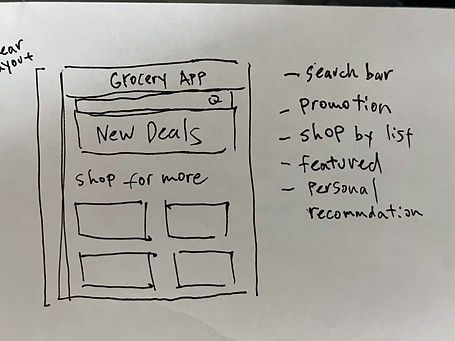
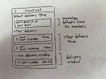
I sketched out some concepts of the grocery app on the information hierarchy of the Grocery App.


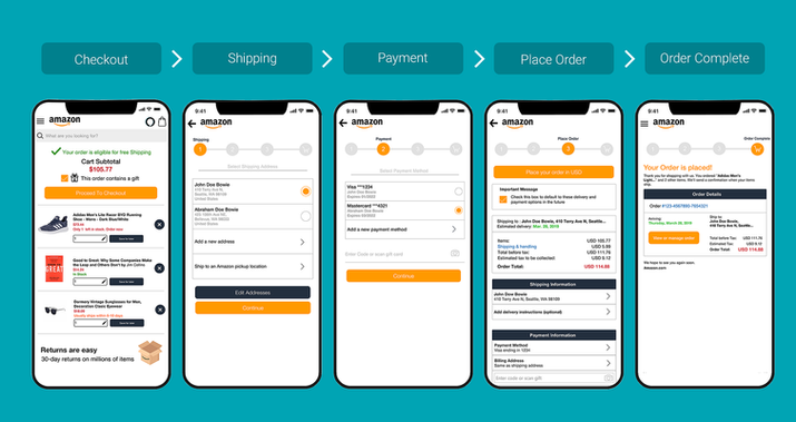
Then, I researched and find every popular shopping app from iOS and Android I could look for to draw inspirations. This was crucial as it helps me shape the aesthetic of the app.
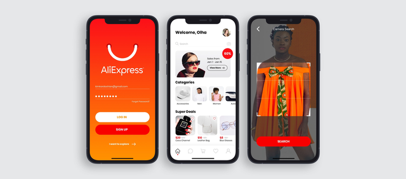
Afterwards, I created a Mood Board to gather idea on what the UI would look like based on my research. I explored the different visual styles I cataloged with information hierarchy I had created earlier.
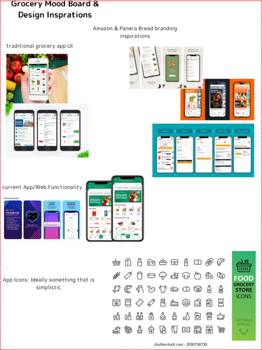
Visual Design inspirations for functionality, UI, icons and aesthetic.
LOW- FIDELITY WIREFRAMING
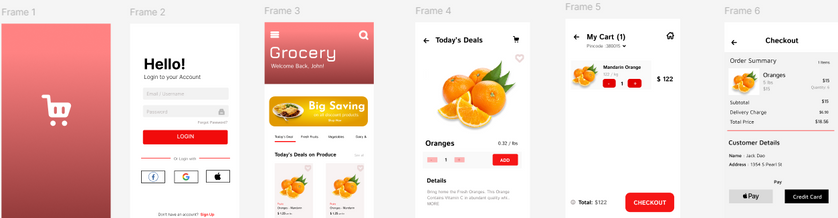
The low-fidelity wireframes were then created and later digitalized on Figma for the mid-fidelity prototype with placeholder text, images, and icons.

Once the low-fidelity were in place, I establish key UI elements into the mid-fidelity wireframe stage envisioning what a customer would've want to look in the first hand. I chose red as the primary color as it reinforces:
-
Energy
-
Passion
-
Urgency
-
Stimulates appetite
USABILITY TESTING
The grocery shopping app has gone through several iterations. As part of my latest iteration, improvements were based on issues my participants faced while taking part in interviews and surveys. In addition, these tests have allowed my participants to give me suggestions for what I can include in improving my application.
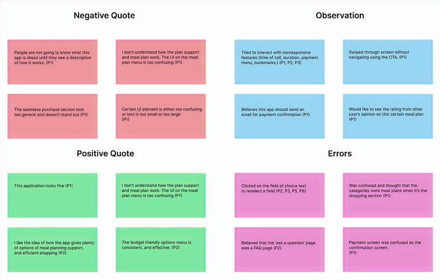
User feedbacks are separated into four categories: Positive, Negative Quote, Observations and Errors to gauge a general feedback from users
REFINING
V2
V1
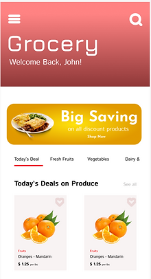
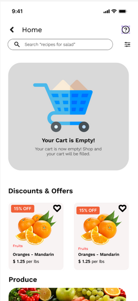
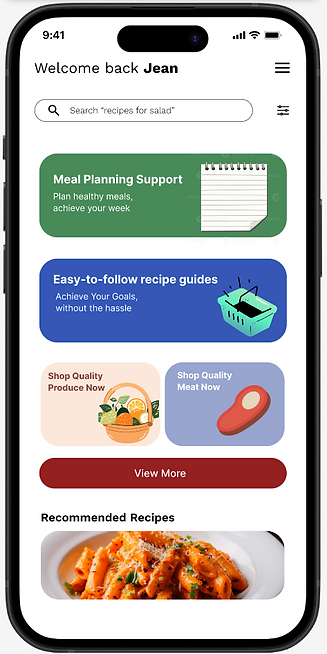
ITERATION: REDESIGN THE HOME MENU
Testing was conducted by user interviews and surveys. About 15 people was interviewed during this phase. The most common issues that needed to be addressed such as:
-
Cumbersome UI
-
Elements either too cluttered or a huge eyesore
-
Icons not recognizable
-
Search Bar is non existent
V2
V1
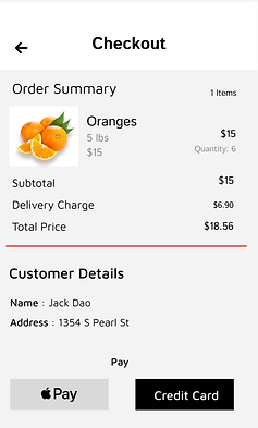
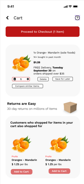
ITERATION: THE CHECKOUT SCREEN
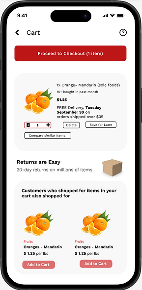
Another common criticism from several user feedbacks was the checkout screen, most users felt it was too lacking and basic. In order to address it, I plan to:
-
Add item recommendations
-
Remove customer details
-
Introduce delivery options
FINAL DESIGN
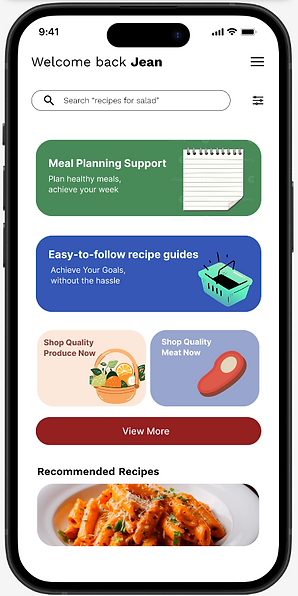
Immersion and simplicity were a strong focus for the final design. I found that having red and white worked best for the interface as it enforces a user's trust with the app.


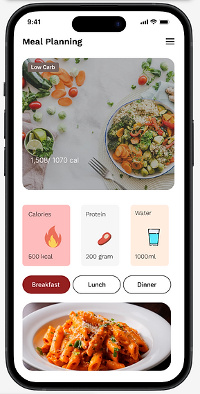
MEAL PLANNING
Create, and customize and find your meal with a simple tap of a button. Accommodates meal plan to user's personal preference.
EASIER SHOPPING
Shopping has never been made easier, easier shopping to ease the convivence of busy individuals.
SIMPLE USER INTERFACE
Interface that's simple, easy and not overly convoluted to the casual or busy shoppers looking to shop.
REFLECTION
In an 8-week period, I produced over 40+ wireframes, updated 20 components and learned how to master the Figma software. Since this was my first UX design project, I have come to learn a multitude of skills and gained experience that I can implement into this application.
Staying in scope felt somewhat challenging, as there were times when I could envision more ways to implement features without diverting my original goal. This provided an opportunity to inform potential clients of best practices and make updates in hopes of laying the foundations for a solid design system.
The following step will be to do more usability test, which will then undergo virtual or in-person usability testing. This way, I can observe how my participants interact with the application and provide a thorough explanation or address any questions they may have in the future.
Let's Work Together!
If you have a project in mind, or would like to chat, shoot me an email at
xiongjin631@gmail.com. I'd love to hear from you.